Get in touch
07855467687
hello@baileycs.com


Portfolio
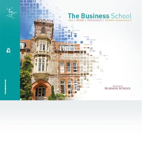
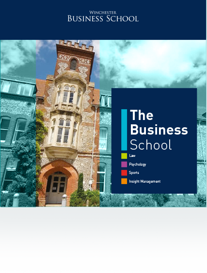
Winchester Business School
The Business School, part of Winchester University, needed a fresh suite of literature to promote the school and their courses.
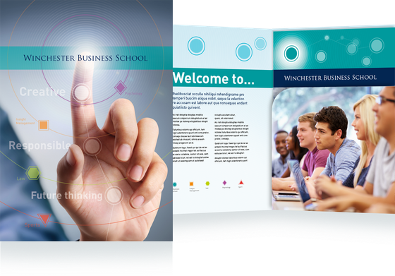


Option 3 - Typographic strength
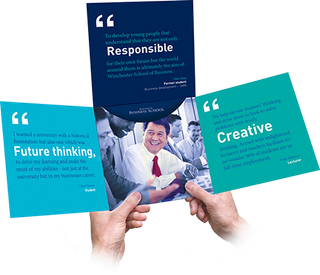
The Business School had three phrases it wanted to retain - Future thinking, Creative and Responsible - and for the final version we wanted to encapsulate these phrases within three testimonials that represented the target audiences - students, lecturers and business leaders.
Imagery focused on the portraiture of the individuals and the typographical treatment highlighted the key phrases within the testimonials. We suggested using a more elaborate device for this version to encapsulate and secure the inserts providing a more elevated quality.
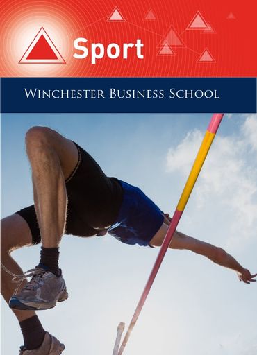
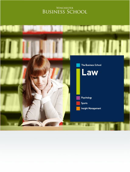
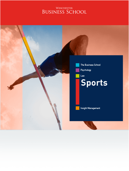
The brochures used simple colour coding with expanding, colour-coded bars highlighting the relevant faculty name.


Need a new approach to you communication?
Let Baileycs help you shape your new marketing material. Call us.