Don't miss the eQlyps
Mark Bailey • October 31, 2022
International product launch for IOW Group
This was a great project to work on and drew on all of our core skills - branding, design, copy writing, script writing, animation, print design, exhibition and web. Basically we did the lot.
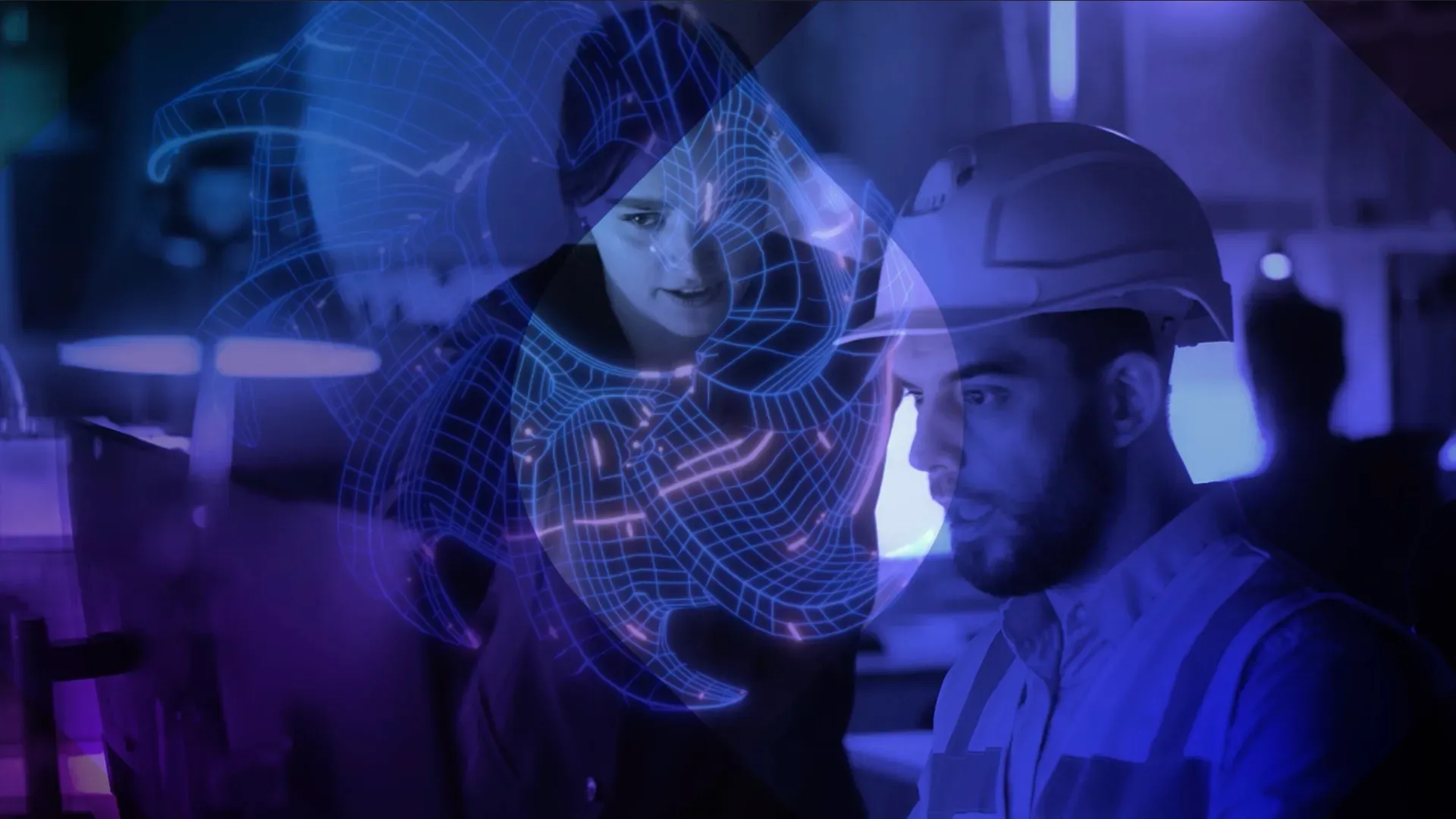
The IOW Group have been working on a ground breaking filtration system that would be launched to an international audience at SMM Hamburg - the leading international maritime trade fair.
BAILEYCS was asked to create a teaser campaign that would provide initial buzz over the 5 weeks before the launch without showing too much of the product and then launch and post launch creative to use across social and other web comms.
At the briefing stage it was clear we needed to create a product name to pin the campaign on and then move forward with some concepts to see how it could come together.
Out of a group of names we settled on eQlyps (pronounced eclipse). Unique in its spelling and available as a stand alone domaine if required. Ideal for search result too. This provided a new unique edge to the well used expression about products eclipsing the competition.
It was important that competitors and prospects alike didn’t get a proper view of the product and the IOW Group wanted prospects to know that the only way they could see the new filtration system was at the show.
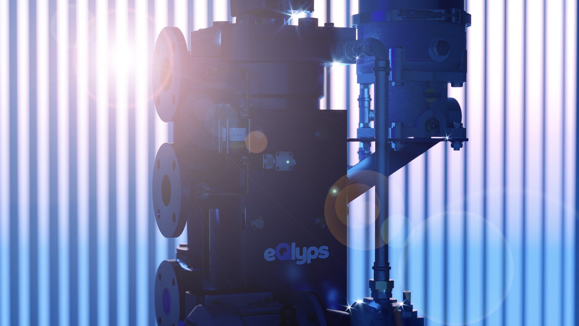
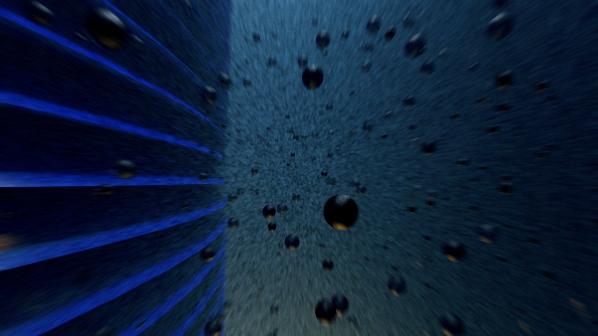
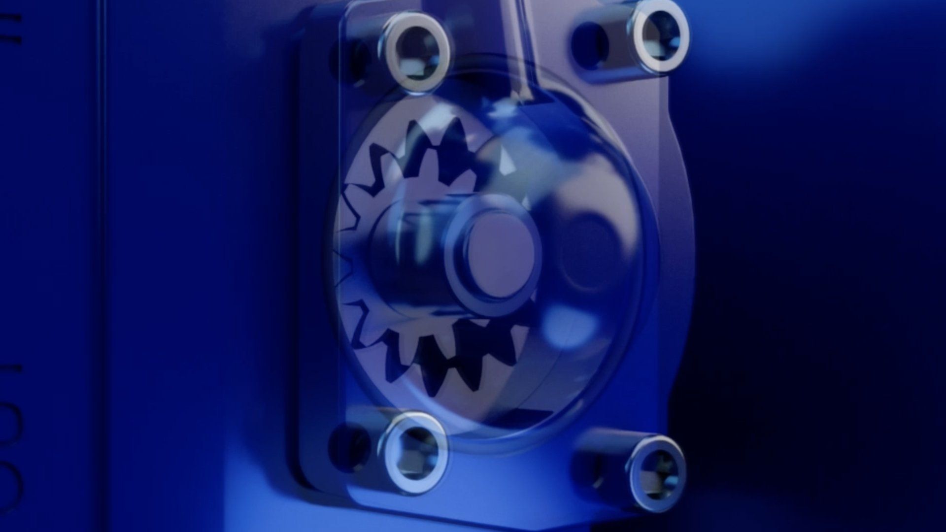
teaser animations
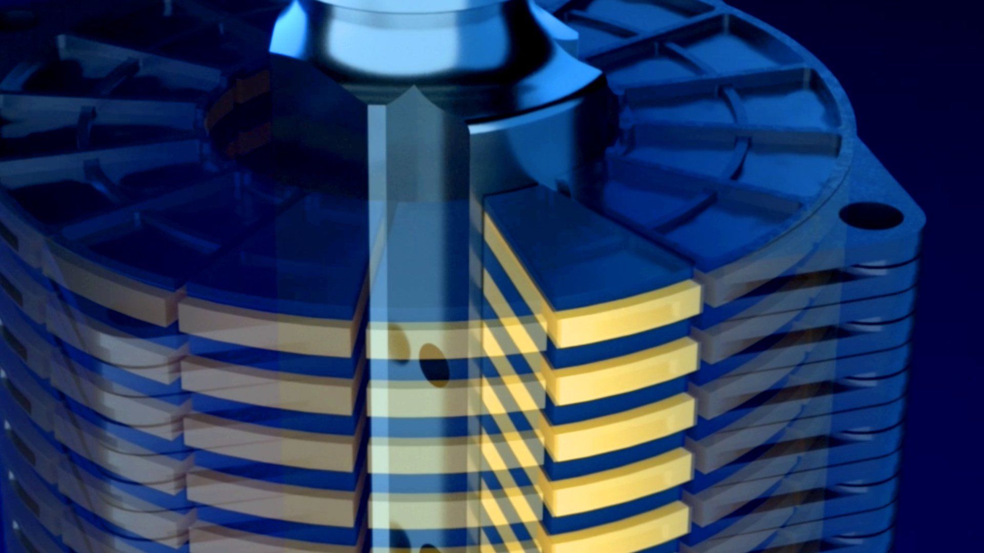
Using close ups of key and unique parts of the product we created imagery and animations with low light and subtle dark tones to create a series of space or inner space scenes. Slow, menacing dark. This would help to hide the product and create intrigue. More like a film release than a product. Like giant space craft slowly closing in on there target - in this case an eclipse.
Key copy headlines
We wanted short and menacing statements that would have double or hidden meaning and not give the game away. The whole product is about removing dirt, soot and contaminants from lubrication oil. Previous competitor products allowed these damaging elements to escape back into the oil. But eQlyps is about to stop all that.
Time is running out - eludes to the fact that something is coming to get you (in the case of the product, if you are dirt and contaminants, your time for destroying engines moving parts is nearly over) .
Soon there will be no escape - still menacing but the hidden meaning is about the new fully sealed product that stops dirty oil contaminating cleaned oil.
The pressure is increasing - unlike other backflushing filters this new product has a magnetically sealed pump which provides enough pressure to add in an MP centrifugal oil separator - its self unique to the IOW Group. This is a key USP. Resistance is futile - once dirty oil enters the centrifuge it will removal contaminants, dirt and soot down to 1 micron. These key messages formed the initial teaser campaign that ran across linked in and Facebook throughout August. On the opening of SMM we launched the product with
It’s here. There will be no escape.
The creative gave a view of the product through opening blinds, light streaming through. Still not giving the prospect a real view of what was being released.
We also needed a strapline. Something bold and authoritative that would search well.
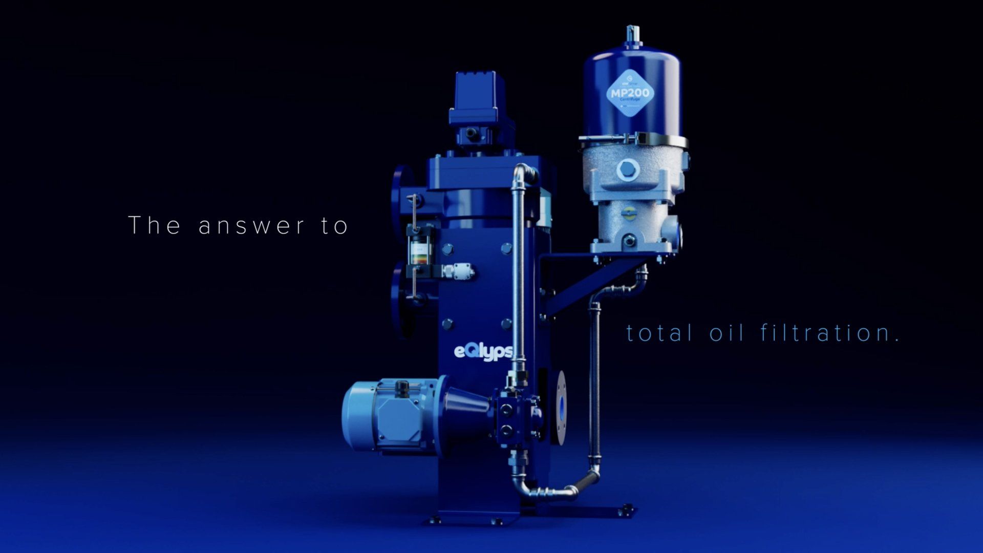
eQlyps. The answer to total oil filtration.
Job done.
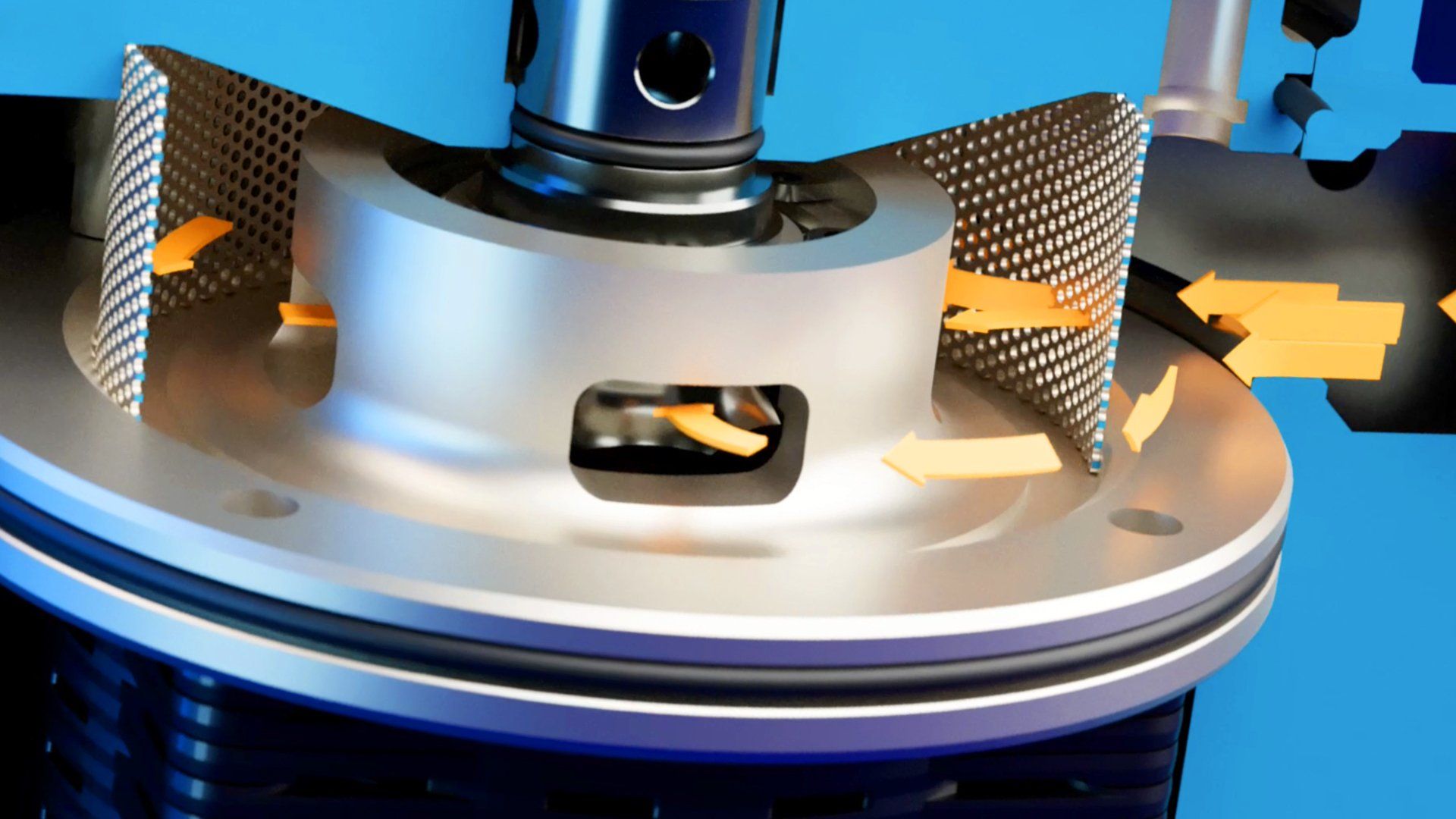
How it works animation
A comprehensive ‘How it works’ animation was also created which would be used across all digital media once the product was launch - from social to company website. This 4 minute animation provides the main support to all comms and provides all the key elements to draw in prospects through YouTube, and all other digital comms.
Supporting 3D imagery
Some of the frames from the animation were also used as stills for the website and the up and coming digital brochure plus we also created other imagery to support specific messages.
Stand graphics
We also put together the stand graphics to support the show and future trade shows. In fact most of the work will be reused over the next marketing period and will provide a cost effective and engaging suit of comms to help sell eQlyps.
Success? You bet!
The launch was a great success - I’d love to say it was all down to our creative work but behind the marketing hype there has to be a rock solid product - and the eQclyps really is the answer to total oil filtration. Congrats to the IOW Group!
#C4D #CoronaRender #AfterEffects #animation #baileycs
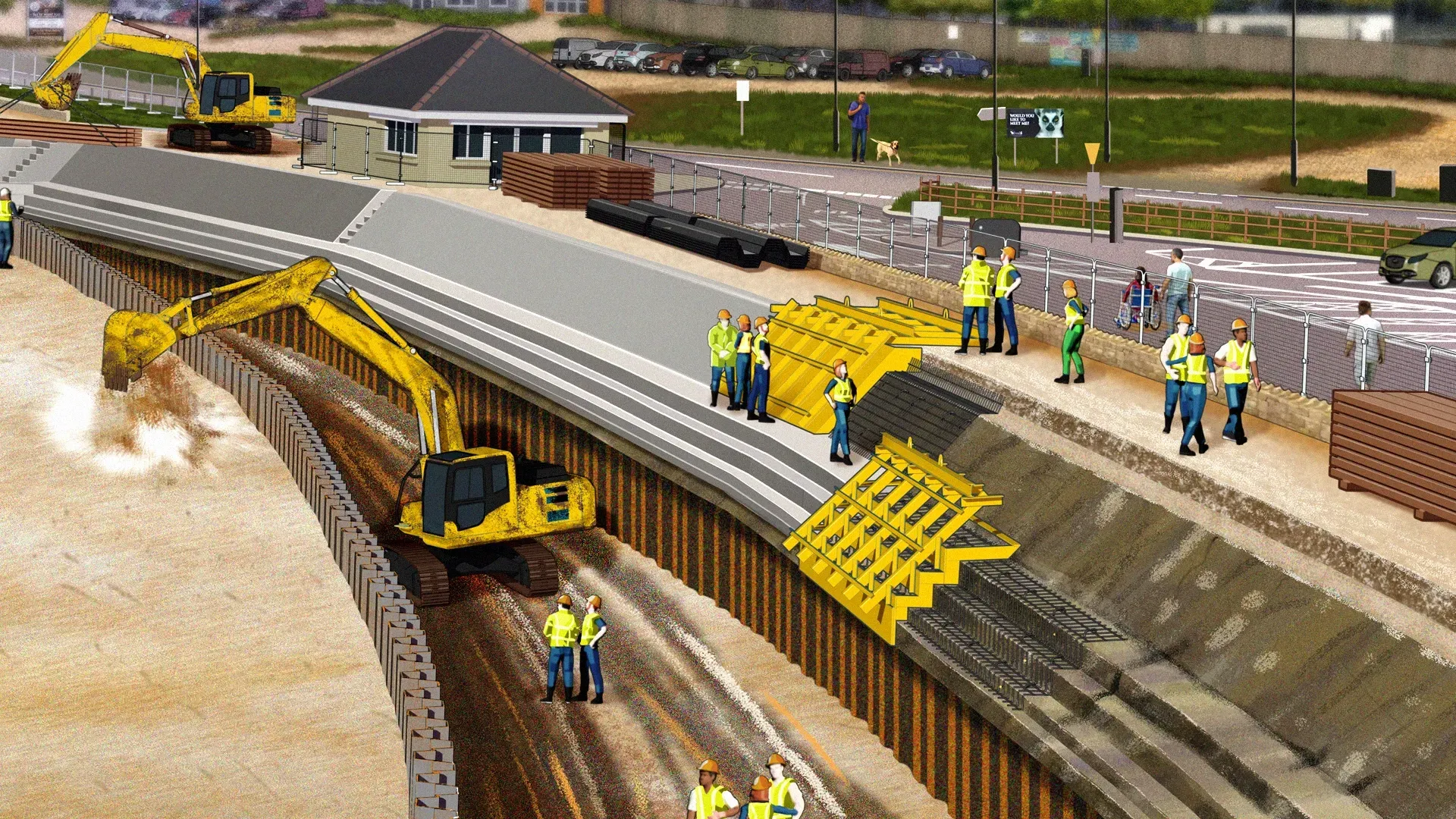
This is the second project that we've worked on with the Environment Agency. After a successful set of illustrations were created for the Pevensey Bay to Eastbourne Coastal Management Scheme, we were approached by project lead, Emily Webster, regarding the proposed sea defence improvements for Sandown and Yaverland. Emily and the team required two main illustrations and several cameos. These would be supplied to their design team to create public consultation material - posters, online assets and other communication assets.
The Baileycs office is lucky to be situated in lovely gardens with a huge variety of flora and fauna. The lashings of rain we’ve had means it’s been a bumper year for nature’s colourful spring and early summer carnival.
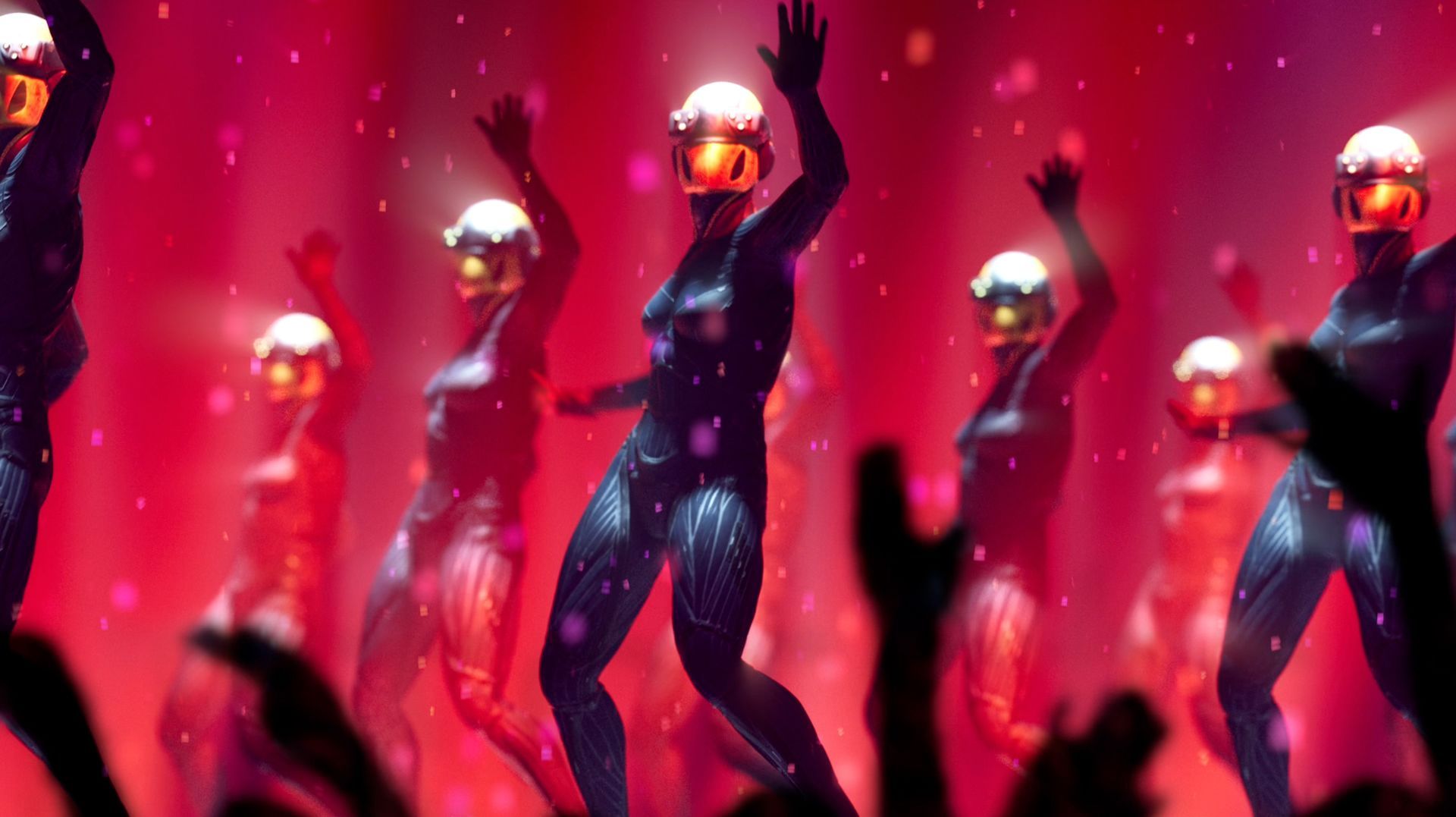
The Futura Girls don their cyber cossies to woo the crowds and dance the night away.
Over the past couple of years BAILEYCS has had the pleasure of providing creative support to The Aqua Stewardship Council (ASC).
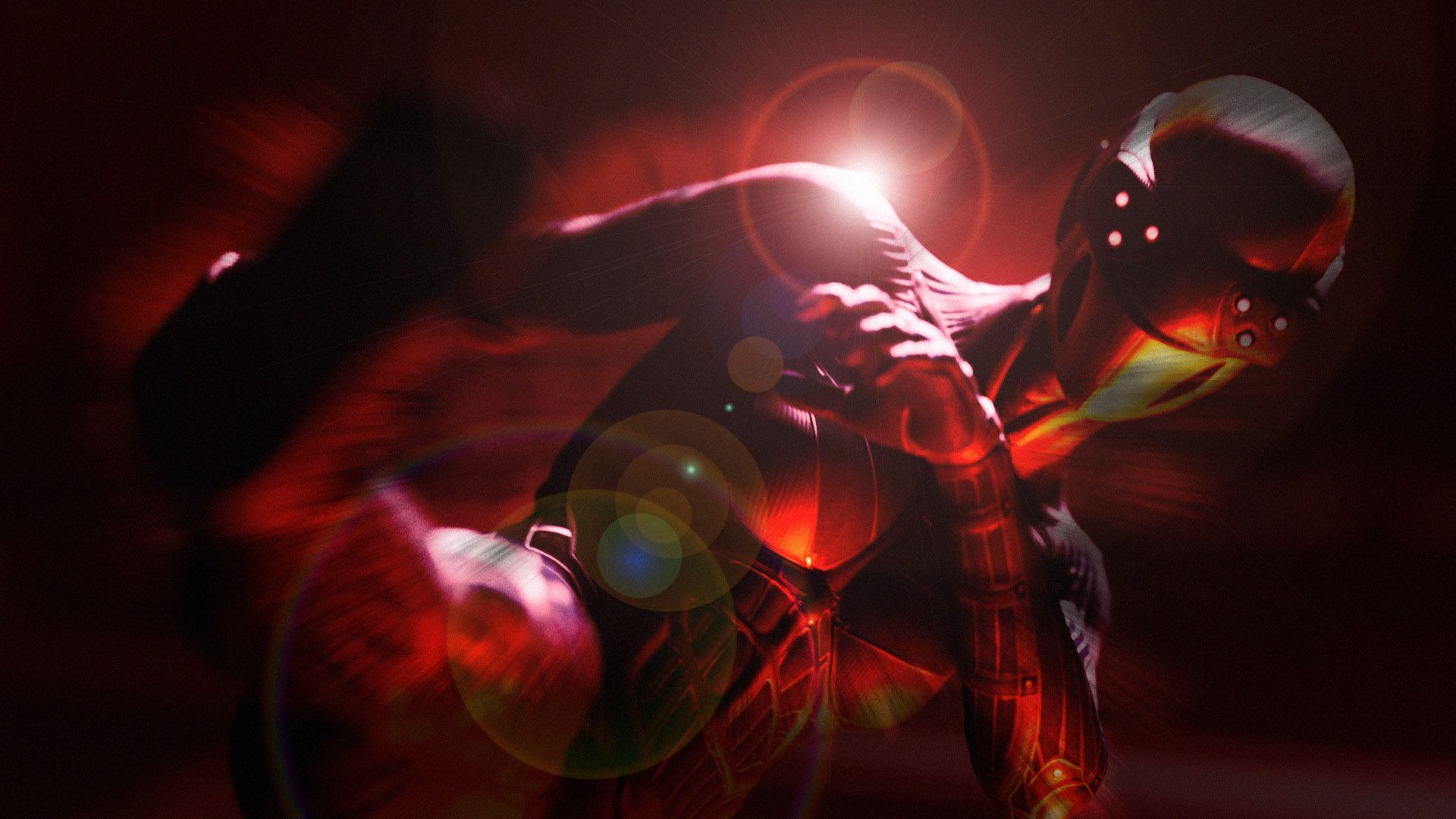
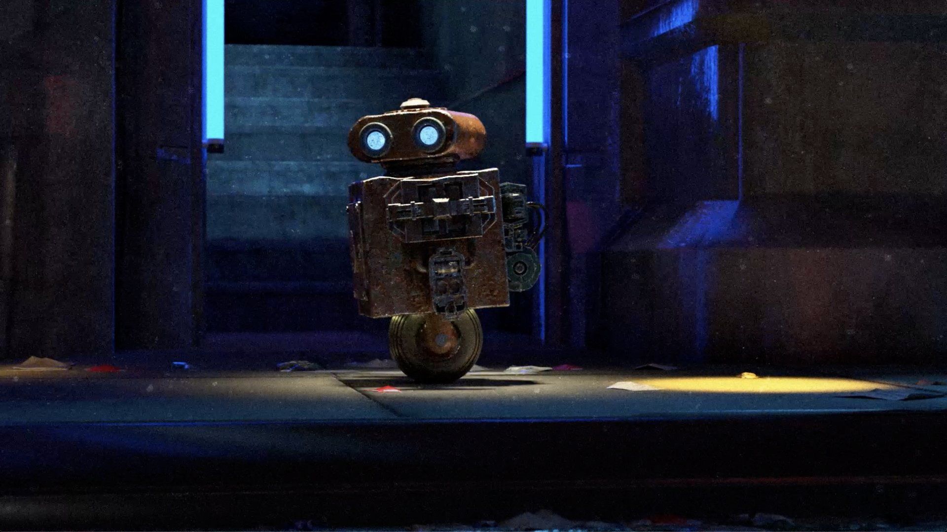
This is my latest bit of animation - Open the Doors. In the quest to increase my 3D knowledge base I create a lot of imagery and animations that rarely see the light of day so sometimes I dust it off and and pull it all together into some sort of story. Hope you enjoy it!
Recently our client, the IOW Group, was looking to expand the number of partners they deal with to help promote and sell their products. They asked us to look into marketing assets to support this activity. There are several issues with partner programs. Businesses can waste a lot of time with prospective partners only to find that they aren’t suitable. This can be for a number of reasons: they aren’t established, they promise the world but don’t have the staff or funding to provide the required support for installation and support for the products, or in real terms, they simply aren’t motivated enough to sell the product. So, the process had to promote the new program and be upfront about the requirements necessary to become a partner.
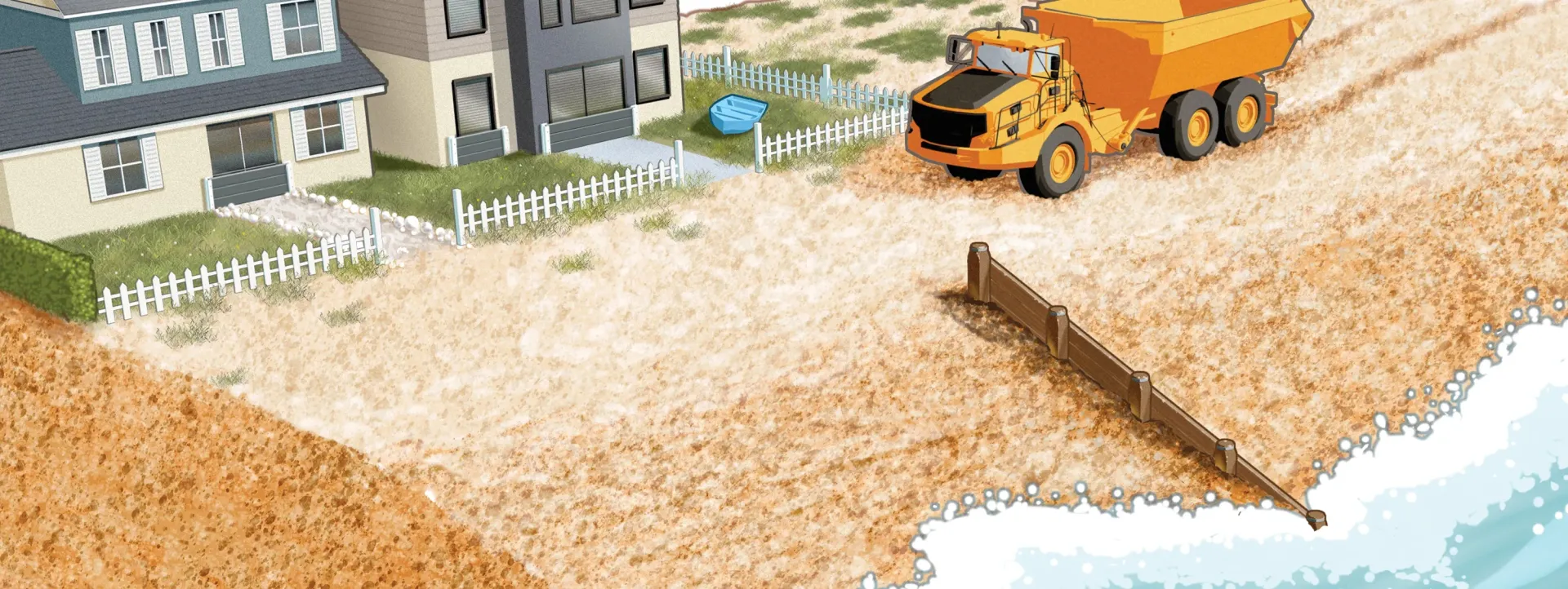
We had the pleasure of working with Sarah Martin and Andrew Walker at the Environment Agency in Chichester and were tasked with creating 8 to 10 images that would be used as part of a wider presentation to help show the public different options and choices that could help protect properties along the Pevensey Bay to Eastbourne stretch of coastline. Initial illustration reference provided by The AE were more traditional (a more typical arch/vis water colour look) although they were happy to go with something different. We pulled together an initial look and feel that was more contemporary in approach which was liked and helped get the project moving. Rough sketches were provided by Andrew and along with our own research initial roughs of each illustration were submitted and amended before creating the final illustrations.
Working with The Woodhorn Group from March 2022 we were asked to create a brand for their new milk vending business that will now be going live September 2023.
It was great to catch up with MSP again earlier this year and create some simple, engaging animations of 6 key messages.
A little retro/future fun for you. Our latest 60 seconds of animation to put a smile on your face and a dance in your step to take you through your week.